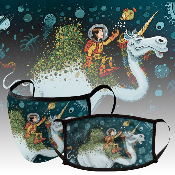
 Did some research on Threadless to see what Masks were doing well and it seems like themes of Space and Isolation and Pets were definitely common there. So I remembered I had this illustration and so I put it up there to see how it does! No harm in trying right? You can buy this at https://daneshm.threadless.com/designs/space-camel/accessories/face-mask/premium
0 Comments
 I've started watching the youtube video 'Will Terry's Top 5 Tips on How to Make a living as an artist' and the first point is about improving your craft. He suggests creating a 'hero wall' of your favourite artists and comparing your art to theirs and seeing what doesn't measure up. So these are the things I found that stuck out the most for now, and luckily there are 7 of them, so I can work on one thing a week..
Must have a target of filling a certain amount of pages per day, lets start with 3 pages per day... date the pages, and keep them together, and after a month see what progress you've made in your illustrations. MONDAY: OBJECTS Paying attention to all the objects in the illustration, giving everything life and personality, not just the main characters. Study seemingly boring objects around you and give them life. TUESDAY: ENVIRONMENT Know where the horizon line and be aware of the perspective you are working with..Do environment studies with horizon line and perspective awareness WEDNESDAY: HANDS Study hands from life, from photos, from other artists, and draw them from imagination. THURSDAY: SHAPES Push shapes and designs a lot more... Study things on a 2d level.. compositions you like, just study the shapes on a flat level. FRIDAY: VOLUME I think doing longer studies of objects or people can help in this SATURDAY: WOMEN Study women from life, from photos, from other artists, and draw them from imagination. SUNDAY: DRAPERY Study drapery from life, from photos, from other artists, and draw them from imagination. I have no idea if these will sell, or why anyone would buy them! But it was fun to do, and fun to imagine someone wearing the combination of the shirt and mask, there is one customer for sure, and that's me!
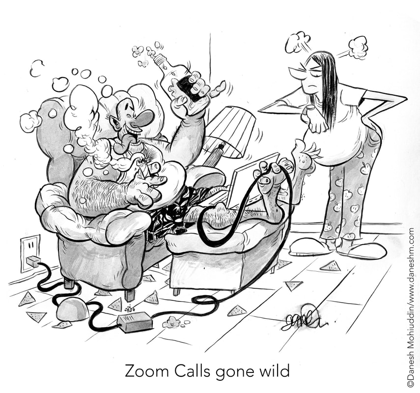
You can buy these things at https://daneshm.threadless.com/ 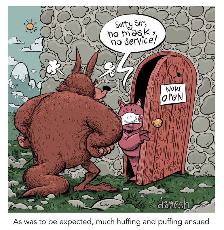 There was an incident at a supermarket in Canada where an aggressive customer refused to wear a mask and went on a racist rant, it was inspired by this cartoon... oh no sorry, it's the other way round, this cartoon was inspired by that incident.
 This came idea came up when I was chatting with fellow illustrator Andrew Dorland at a RAID (artist collective) social distanced bbq on Monday.
I also got a letter on Instagram detailing that perhaps it was culturally insensitive to depict a man with blue face paint on the left. This could be taken the wrong way, as a political statement saying that Scottish people have been acting like this in the pandemic. Really, my only purpose was to make the revolt as dramatic as possible and have a point of reference that people could relate to (braveheart movie) and make the situation even more ridiculous.  Spent Sunday at the Center island in Toronto.... Thankfully it wasn't actually this crowded.. while we were there... well this is summer in 2020, who woulda known.
 This is a strange one, I spent all morning thinking of an idea.. came up with this, then the penciling and inking was fine but spend ages on the colours! I didn't have a clear idea when I was drawing it and thats why it took so long. Somehow I need to have the decision made in advance, or perhaps do some rough colour sketches and choose. Anyways, a frustrating experience! In the moment my drawings always seem bad to me, and as time passes and I look back, I realize they're not so bad after all.
Do the colours work? I don't know, I experimented with so many. The colour choice was important in this one as it helped with the message. In this case, maybe. I don't want to ruin this cartoon my overanalyzing it. It is what it is, time to move on!  My original idea was to show that Canada was a diverse place and the letter colours are different skin colours.. might have been a bit too subtle though, who knows! Below is the original drawing and you can see that had some more stuff in the background, but I got rid of it, as I felt this was stronger by itself!   I'm really happy with this weeks illustration! I used a combination of brush and dip pen which I have never done for a commercial illustration and it worked well. The pen worked for smaller curves, details and 'hard texture' (like the bricks) objects while the brush worked for bigger curves, more sweeping lines, and 'softer textures' (like the ground and grass). Funnily enough as I was doing it, I knew exactly what colours I wanted to use, so that saved the decision making and experimenting time later! The article is not out yet, but when it is I will post the link. Oh yes, here is the original sketch proposal..  I'm really glad they went with A! B would hav been fun too though, and C would have also been fine, but definitely my las choice. I'm working with a great editorial team here.
 For some time I was maintaining the habit of reading fiction everyday out loud (paid more attention that way) and this is a wonderful book. Love the way it's written with different people's accounts. However this cover was terrible and I felt I had something better in mind... 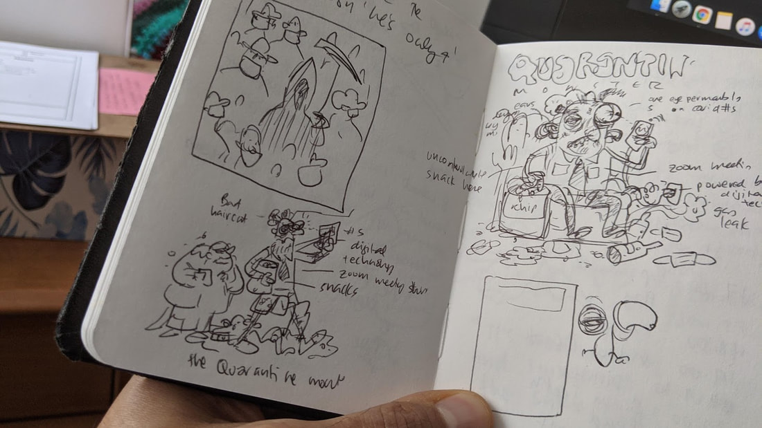 This is the original thumbnail I did real quickly, very small sketch, barely the size of my palm. Somehow it turned into a circle, and since it wasn't really for a real book, this was fine. Next stage, I scanned it, lightened, made it bigger, printed it, then refined it with pencils.  The pencils stage were done on a letter (a4) sized page. I really like how the negative space from the test tube fumes formed the background of Mr Hyde. Next, I scanned it, lightened it and printed it in on photo blue on a bristol paper of 11x14 inches.  I was actually really happy with the final inks! The negative and positive shapes played out really well, and am happy with the lettering too.  And here is the final piece! I definitely lost of the negative positive interplay of the black and white version, but gained a lot in the mood of the piece, Dr Jekyll stands out nicely, while Mr Hyde is sinisterly blending into the red background. I feel there is good balance and harmony in this piece. It wasn't a big hit on instagram, but the right people liked it, and most importantly, I was happy with it!
|
Danesh MohiuddinTravelling illustrator with a love of comedy, history and music! Archives
June 2024
Categories |
 RSS Feed
